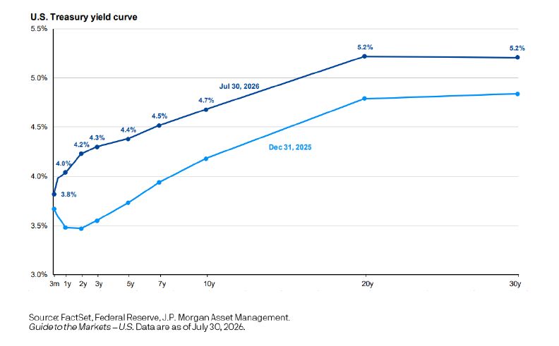
The Chart of the Week compares the U.S. Treasury yield curve on December 31, 2025, with the yield curve on July 30, 2026. While the chart itself is relatively simple, it is one we follow closely because it offers valuable insight into investor sentiment, inflation expectations, and the broader economic outlook.
As the chart illustrates, Treasury yields have moved higher across all maturities during the first seven months of 2026. This shift reflects investors demanding greater compensation for inflation risk as price pressures have remained more persistent than many anticipated. Because inflation reduces the future purchasing power of fixed interest payments, bond investors generally require higher yields to offset that risk.
Higher yields have also weighed on bond prices, helping explain why many fixed-income investments have produced relatively modest returns so far this year. A key contributor to ongoing inflationary pressures has been the rise in oil prices, which surged in March following the conflict with Iran and disruptions in the Strait of Hormuz. Beyond the immediate impact on gasoline prices, higher energy costs have increased transportation, manufacturing, and operating expenses across a wide range of industries. As businesses absorb these higher costs, many ultimately pass them on to consumers, creating additional upward pressure on inflation.