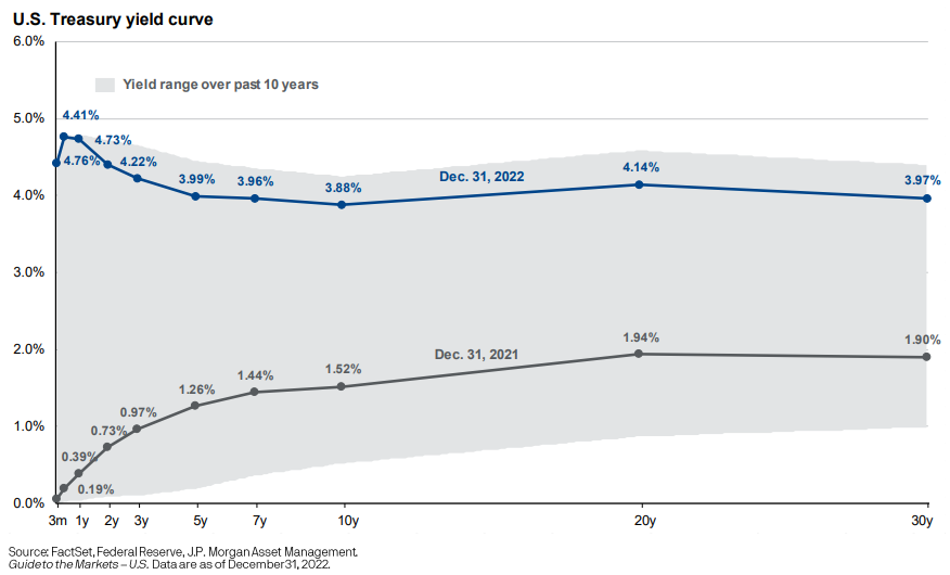
The chart of the week looks at the US Treasury yield curve from 3 months to 30 years. The grey area shows where the curve has been over the last decade. The top blue line shows it as of year-end 2022 and demonstrates an inverted yield curve. The bottom grey line is as of year-end 2021 and shows a more normal shape of a yield curve. What a big difference a year can make! As you can see, current yields on the short end of the curve basically went from 0% to well over 4% in a year, and reached the highest level we have seen in the last decade. The yield curve overall moved higher, as well, with the 10-year moving up over 150% and 30-year Treasury more than doubling. 2022 was truly repricing in the bond markets. We are interested to see what 2023 will bring.