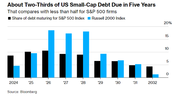
The chart of the week is an update on a previous chart where we looked at the debt maturities of S&P 500 companies. The chart showed that about 46% of current debt expires after 2030, and we tip our cap to those CFOs who extended debt maturity at lower rates. This week’s chart looks at the S&P 500, or large caps, versus the Russell 2000, or small caps. The blue color represents small caps and as you can see, they have much more debt maturing before year-end 2030 than do large caps, landing over 70%. Refinancing this debt at likely higher, or even much higher, interest rates could create a headwind for small cap companies.