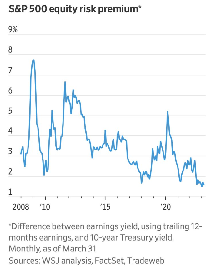
The chart of the week looks at one way to compare the attractiveness of stocks versus bonds. This metric is called the equity risk premium. The equity risk premium basically shows the expected return from stocks over some risk-free rate, in this case, the 10-year Treasury. The equity risk premium is the difference between the earnings yield of the S&P 500, which is the average earnings per share over the previous 12 months, divided by the current price of the market or the inverse of the P/E ratio, and the 10-year U.S. Treasury yield. You can see the premium is currently lower than it has been, which is a result of a combination of stock prices recovering while we are likely in an earnings recession along with rising interest rates. The premium was much higher during the beginning of COVID, when stocks dropped in price and rates basically went to zero, which also happened during the financial crisis.