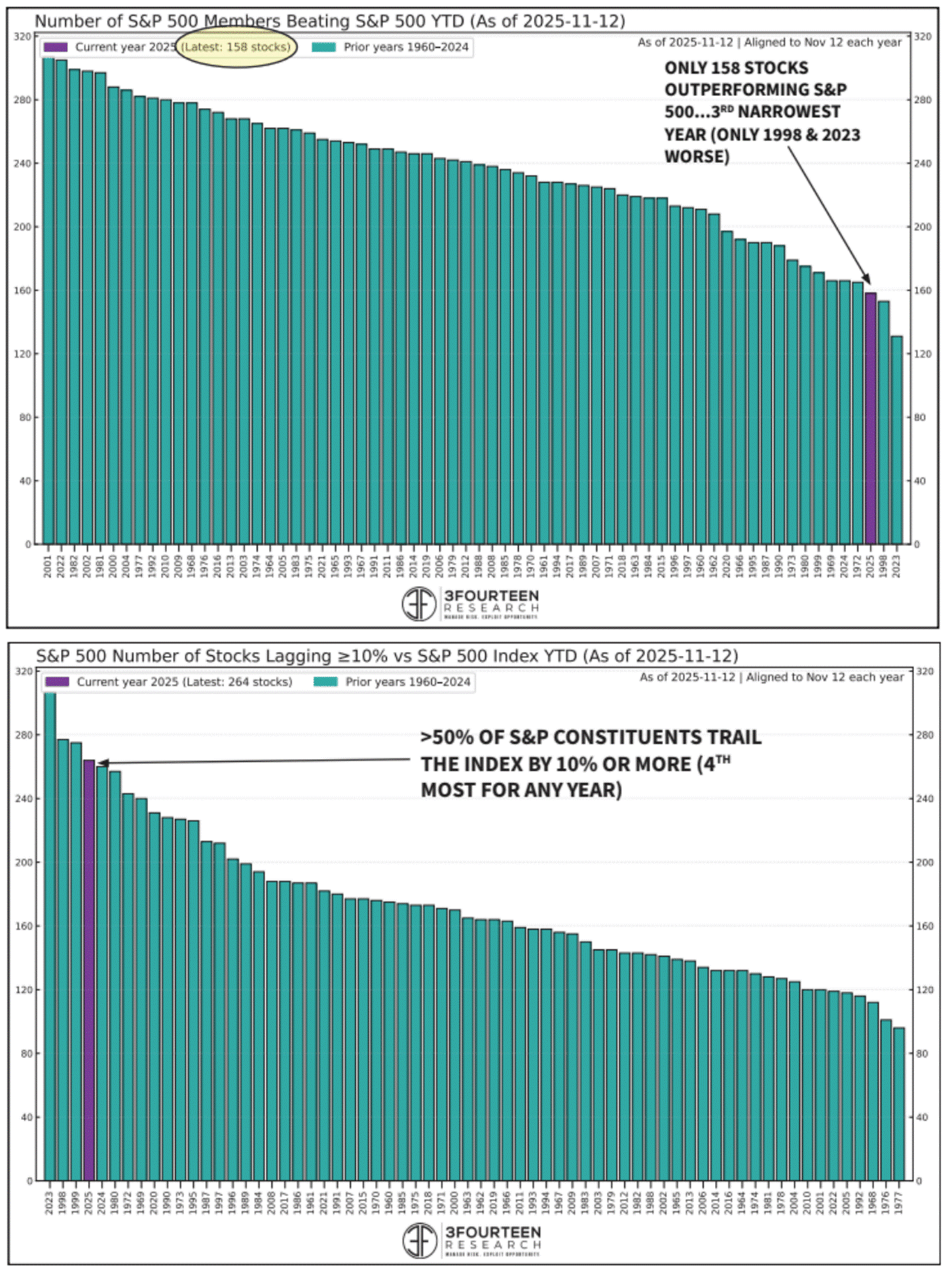
 The charts of the week highlight the S&P 500 and how individual companies are performing relative to the index. The top chart displays the number of S&P 500 companies that have outperformed the index each year since 1960. All prior years are shown in teal, while the single purple bar marks the current year, in which only 158 companies have beaten the index, the third-lowest total in the past 65 years, behind only 1998 and 2023. This underscores the growing concentration within the index, where the heavy weighting and strong performance of the largest companies have disproportionately driven returns. The bottom chart reinforces this theme, showing that over half of the index’s companies are lagging the S&P 500 by more than 10%, the fourth-highest reading since 1960. As we’ve noted before, concentration behaves much like leverage: it works wonderfully on the way up, but when momentum reverses, the downside can be sharp. Investors beware.